
This issue has been a very annoying one. Unfortunately, with a recent update of Google Sheets one cannot change the colors of bar graphs within a single series (“series” meaning the same string of data, such as number or percentage you’re measuring) UNLESS you do this one simple trick.
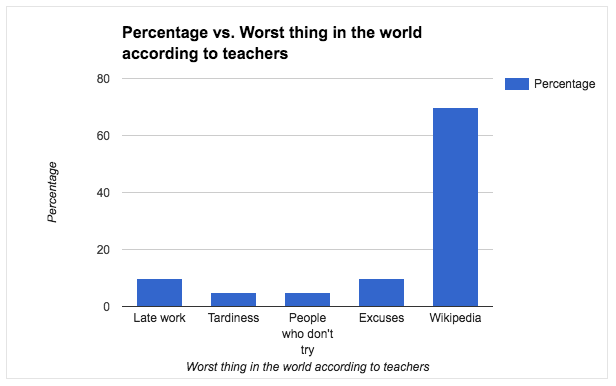
Here is what many people do when making a chart… which, as you will soon see, does not work exactly how it should.
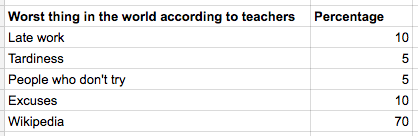
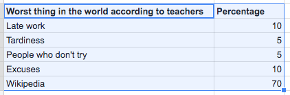
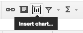
As you may know, highlighting the data and clicking the insert data icon is how you get to charts. See screenshots below.
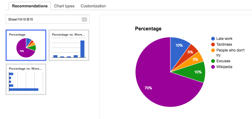
This is the suggested chart, which has colors as you see.
But what about inserting line chart?
Thanks to this post, here is what I found DOES work.
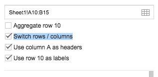
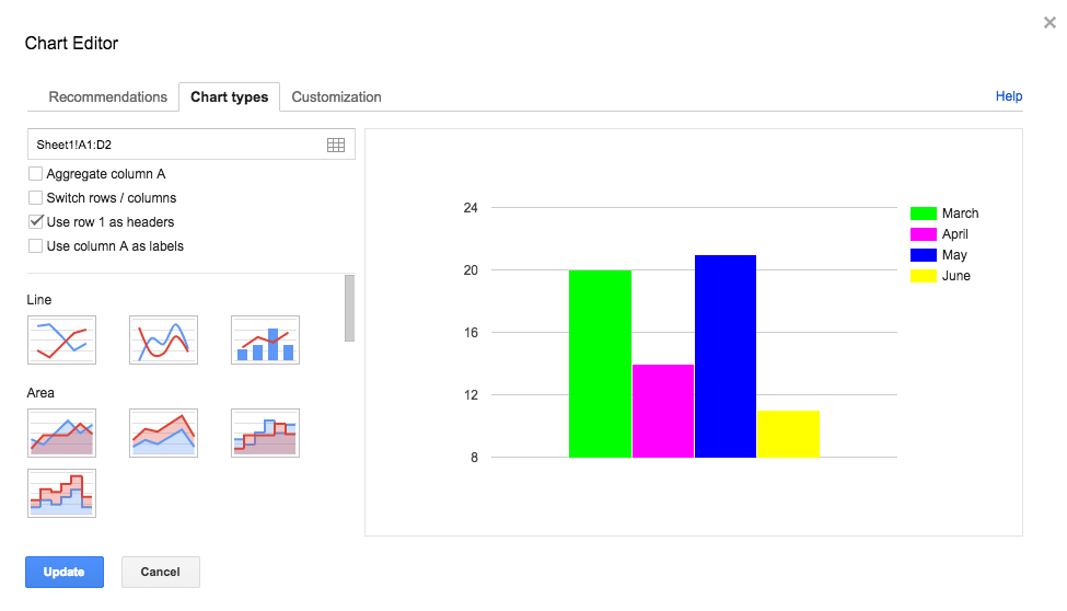
First, navigate to Chart types tab. ![]()
Then, check the “Switch rows / columns” option.
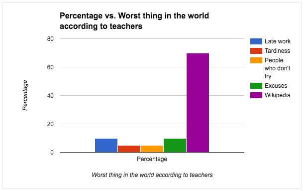
The chart will change slightly, but now you have colors!
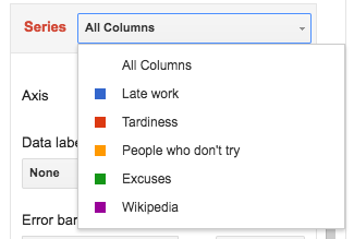
Further customization, like changing each series, is now available.
Navigate to the Customization tab. ![]()
You can now edit each columns color (which are actually rows you made in your sheet, but since you switched rows and columns earlier this works).
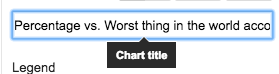
Finally, use the title section if you want to change things. Because I had “percentage” added into my column above the numbers it automatically added “percentage vs…” but as you can see, this can be edited also.
Here is a recent example I came across… If you have your data titles in the 1st row, having this as your option may give you similar results. Notice I selected Use row 1 as headers.
You must be logged in to post a comment.